Traffic Sign Shapes and Their Meanings

Understanding traffic sign shapes is essential for anyone involved in road safety, traffic management, or site operations. In the United States, the Manual on Uniform Traffic Control Devices (MUTCD) mandates specific shapes for each sign function—ensuring drivers react appropriately even in poor visibility or if color fades. Unlike sign color (which offers critical, but secondary cues), shape is the foundational layer of traffic sign coding and the key to instant recognition.
Why Shape Matters in Road Safety
Traffic sign shapes are assigned not for aesthetics, but for clear, rapid decision-making. Each major function—STOP, YIELD, WARNING, GUIDANCE, SCHOOL ZONE, etc.—has its own unique geometry, reducing confusion, supporting compliance, and improving accident prevention. Cognitive studies confirm that drivers process shape faster than words or symbols, especially at high speeds or in challenging conditions (FHWA, MUTCD).
Standard Traffic Sign Shapes and Their Functions
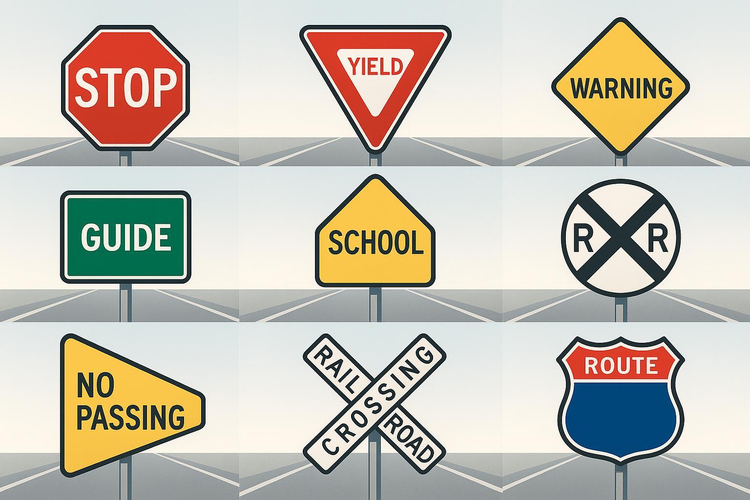
Below is a comprehensive chart mapping each standard MUTCD shape to its regulatory meaning:
Shape | Example Message | Function | Typical Color |
|---|---|---|---|
Octagon | STOP | Regulatory (Full Stop) | Red with white |
Triangle | YIELD | Regulatory (Yield) | Red & white, inverted |
Diamond | Curve Ahead, Merge | Warning | Yellow or orange |
Rectangle (Vertical) | Speed Limit, No Parking | Regulatory (Rules) | White, black |
Rectangle (Horizontal/Square) | Direction, Rest Area, Street Name | Guide/Information | Green, blue, brown |
Pentagon | School Crossing/Zone | Warning (School Zone) | Yellow, fluorescent green |
Circle (Round) | Railroad Ahead | Advance Warning | Yellow with black |
Pennant | No Passing Zone | Warning (Left side) | Yellow with black |
Crossbuck | Railroad Crossing | Regulatory (Railroad) | White with black |
Shield/Trapezoid | U.S. Route Marker | Route Identification | Variable (often white/black) |
Reference: MUTCD shapes and functions
How Shape, Color, and Symbol Work Together
Shape is always unique for the most critical messages (e.g., only an octagon is used for STOP—drivers react to this shape even if approached from the back or at night). Color adds redundancy: red universally signals prohibition, yellow/fluorescent green indicates warning, and green/blue/brown guides. Symbols and words reinforce the message, but the geometry of the sign is your first and most reliable warning—especially for colorblind or distracted drivers.
Real-World Importance: Work Zones & Safety
Best practices cite that using a correct shape at decision points in work zones (like a diamond for hazard warning or a vertical rectangle for new speed limits) directly reduces driver hesitation and violation rates. Safety audits from state DOTs note that misapplying shapes (such as a square for STOP) can increase risks and undermine legal compliance.
Common Misconceptions
Myth: Color alone is enough. Fact: Shape is the critical cue, especially if color fades or is obscured.
Myth: All rectangles mean regulatory. Fact: Vertical rectangles regulate, horizontal ones guide.
Myth: Diamonds are only for construction. Fact: Diamonds always indicate any warning, not just work zones.
Extending Your Knowledge
For a deeper dive, explore these related resources:
Want to ensure your site or project is using compliant, effective signage? Consult federal and state guidance or download regulatory tables for quick reference. For comprehensive insight on sign deployment, explore MUTCD and FHWA manuals, or reach out to industry experts for tailored advice.